Meet Watson, a digital asset aggregator designed for cryptocurrency buying and selling. Previously, Watson was designed for advanced users, who know the financial industry on top of following the ever changing cryptocurrency market. My team and I designed the education center to introduce cryptocurrency to a new group of users, looking to get into crypto but not sure where to start.
WATSON EDUCATION CENTER
Duration:
1 Week (August 2021)
My Role:
User Experience Designer, Mobile Experience
My Team:
Jason - User Experience Designer, Desktop Experience
Daniella - User Experience Designer, Desktop Experience
Isea - Content Writer
Tools Used:
Figma
Mural
Zoom
Microsoft Teams
understanding the problem
Problem Statement
Existing customers at a financial company are interested in cryptocurrencies but are unsure of how to get started and are nervous to buy with their lack of knowledge.
What is Cryptocurrency
Crypto-assets are digitally issued unlike tangible currency issued by the government. It uses a technology called blockchain which encrypts information to keep it safe and verify transactions. Information is stored in blocks that are connected together to form a chain, known as blockchain. Some well-known examples of cryptocurrencies are bitcoin and etherum.
What is Watson
Watson analytics follows and displays trends, prices and data. Its target audience currently is advanced users, institutional customers and investors interested in bitcoin. Watson’s biggest pain points in the context of this problem statement is that it is not for novice users or retail clients, and only sells bitcoin.
who are the users

Poppy Mae-Faulkner
Age: 28
Job: Software Engineer, works 50+ hours a week
Lifestyle: Single, lives alone in a metropolitan area
Communication: Prefers email and social media
Goals:
Learn more about cryptocurrency
Start investing in cryptocurrency
Challenges
Not confident in her background knowledge on cryptocurrency
Doesn’t have much time to sit down and learn something new
Understanding Poppy
After developing our persona, my team and I worked through both an empathy mapping and user journey mapping exercise in order to better understand Poppy’s point of view.

Poppy’s Empathy Map

Poppy’s Crypto Journey
Poppy represents a new class of investors Watson is evolving their focus towards. With younger investors looking for guidance, we need to shift in a way where we can educate users like poppy, who are not only looking for ways to buy and sell but to learn as well.
analysis
After gaining a better understanding of Poppy, the team and I went through several exercises to determine a starting point prior to designing the interfaces themselves.
How Might We’s
My team and I wrote down “How might we” statements to navigate and sort through all of the areas we can focus on. We then voted on the 3 statements we wanted to focus on the most:
How might we warn customers about the potential negatives of crypto without scaring them?
How might we best explain crypto terminology to new customers in a non-overwhelming way?
How might we educate users with different experience levels (beginner vs advanced)?

All of the “How Might We” Statements we came up with
Key Themes Post Analysis
Language
Should be conversational using simple language, funny to keep things light hearted and be used as a way to build trust between the user and Watson.
UI & Graphics
Color coordination used throughout with a clean and modern feel. UI should be clean and uncluttered with distinct call to actions and clearly sectioned. Color contrast and UI patterns should follow accessibility guidelines.
Content
Focus on guided experiences with graphic components related to content and avoiding information overload. Images should have captions and content overall should be accessible to all users.
design iterations
Rough Idea Sketching & Crazy 8’s
Every member of the team took twenty minutes to jot down some ideas and put together some rough sketches based off of all of the information we had gathered previously. Then My team and I each folded a piece of paper into eight sections and sketched one feature, within one minute, per section. Everyone did the exercise twice, my sketches are shown below.

Rough Idea Sketching

Crazy 8’s
Solutioning
Based off of the previous two exercises, each member took some time to come up with a concept for the product. From there everyone voted on which solution we liked best. My solution is shown on the left along with the solution the team voted for on the right.

My Initial Solution

The solution the team and I voted for
Information Architecture
After deciding to focus on creating a Watson Education Center, we all discussed features we wanted to include and developed an information architecture. However, the IA we developed was to complexed for our timeframe so we narrowed down what would work for a minimum viable product (MVP).

Areas outlined in yellow are what the team and I decided to focus on for the mvp.
Prototyping
When creating our first prototype, we each took on areas to focus on, myself in particular working on the mobile experience. Other areas worked on included the desktop home page, the desktop guided education feature, and content used throughout the entire prototype.

Education Center Home Screen

Matching UI, Example Question

Matching UI, Incorrect Answer

One of the key areas of focus for this iteration of designing was to translate the desktop interfaces to fit mobile standards while still fitting into one cohesive experience. Our team couldn’t take a mobile-first approach as we were working simultaneously. Instead, we worked on assets together, with continuous communication (utilizing Zoom and Figma) in order to create our UI’s.
user testing
Interviews
Our user testing consisted of 6 interviews conducted by my team members and I. Each of us took turns walking through and narrating the prototype while others took notes from the feedback. The users ranged in age and gender, all of them worked within the financial and tech industry.
Key Feedback From User Testing
Home Page
“rework hierarchy and reduce visual noise”
the welcome message can be confusing at times and was mistaken as a clickable object as it looks the same as the other areas on the page
Matching
“reorganize layout and reduce color blocking”
looks like a drag and drop interaction when it isn’t
there is no hover state on mobile (the original prototype would have the answer cards turn a shade darker when hovered over)
give users more time to read the reasoning if they choose an incorrect answer, let them select when to redo the answer
Flashcards
minimal feedback on this UI
most thought it tied in well with the desktop version
final product

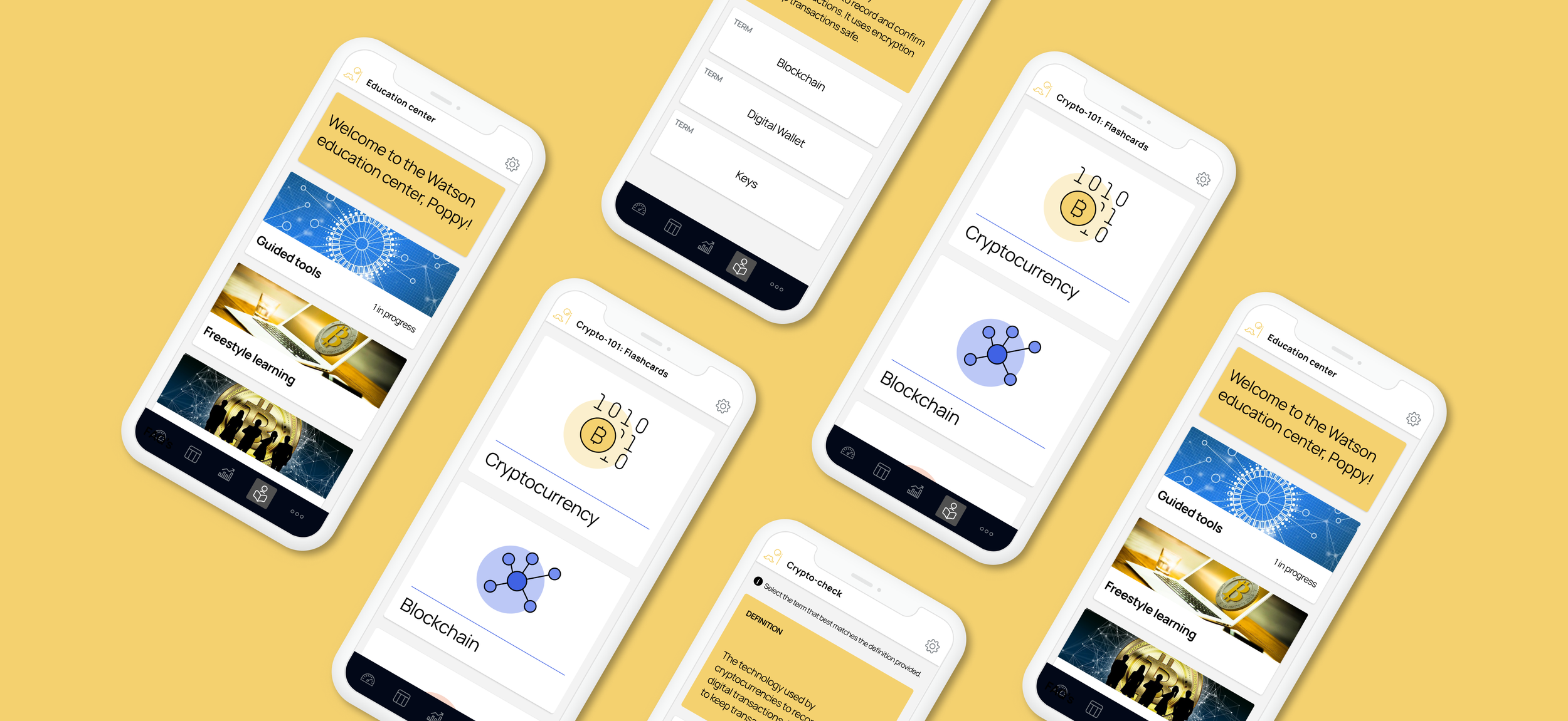
Mobile Home Page
Simple fixes were made to the
Removed the Image on the header to make it more distinct from the other content on the page

Previous mobile Home screen along with the final desktop version
Matching
Users select the term based on the definition provided on top of the screen.
Only the definition is provided to improve focus and type hierarchy
Users are given the option to try again on their time with the “try again” link
There is no longer a change in color when hovering over something as there is no hover state in mobile


Mobile Flash Cards
No changes were made for the flashcards during this iteration as there was a lack of feedback in this area
most users were either satisfied or provided no feedback for this feature
Previous mobile flashcards screen along with the final desktop version
looking ahead
Next Steps
During the ideation process of this project, my team and I decided to cut some features we were excited about. This was due to a lack of time since this was a week-long design sprint. That being said our next steps would be to start to develop the features we had to cut. The features we would like to go back to are the following:
Community Threads
Expert Webinars
Chatboxes
Lessons Learned
Aside from the lack of knowledge in the area of cryptocurrency, my team and I learned the most from getting into the head of the user and our user testing. The following was our biggest takeaways:
Mindest Shift - while developing our persona of Poppy, we were really able to get into the head of our target user. Throughout the summer I personally was working with already established user personas so going through the process of creating our own persona was a learning experience for me.
Overstimulation and Scaling Back -This being an intern project, my team and I really wanted to make something fun and enticing. While I still think we accomplished that, within the earlier stages of design, we had a tendency to overload our pages with features. A majority of the feedback given to us was that users did not know where they should be looking or where to start. A key lesson from this project for me was learning how to design the best solution for the user, not designing the coolest UI.